Wednesday 27 February 2013

COLLABORATIVE BRIEF//TED BAKER//MY CONCEPT BOARDS//OUGD503

CONCEPT BOARDS
These are the boards I have designed for my contribution to our initial concept boards, Sophia has created another set which we will combine to outline our ideas and show visuals.  We will design them in a similar style to keep it consistent.


WHAT IS GOOD?//WORKSHOP SESSION FOUR//OUGD505

WHAT IS GOOD//WORKSHOP SESSION:

5 WORDS THAT SUM UP MY GOOD:
  • culture
  • french
  • parisian
  • city
  • travel
5 WORDS THAT SUM UP MY TARGET AUDIENCE:
  • cultural 
  • young
  • adventurous
  • tourist
  • working
TONE OF VOICE:
  • light hearted
  • informative
  • educational
  • exciting
  • helpful
5 PRODUCTS:
  • zine
  • booklet
  • information pack
  • app
  • letter head
5 PROCESSES:
  • embossing
  • foiling
  • laser cutting
  • binding
  • letter press

AN EXHIBITION OF

EDITORIAL AND PUBLISHING 
BRANDING AND IDENTITY


DESIGN//CONCEPT BOARD FEEDBACK:

DESIGN BOARD ONE - WHAT IS GOOD?
  • good photographs - experiment with this style of photography
  • cafe culture - could open opportunities to rebrand a cafe
  • good outlining of what you want to do - clear to see what direction the brief is going to go in
  • try and make sentences shorter to make it more readable
  • strong use of photography to support statement 
  • you've outlined the aspects of Paris you want to look into - this is good because the subject is quite broad but you've chosen specific areas to focus on
  • good description of your concept, however bit too much to read
  • really good presentation boards
DESIGN BOARD TWO - RESEARCH
  • shorten writing on boards x2
  • I like the cafe culture idea
  • good research, shorten for boards though
DESIGN BOARD THREE - PUBLICATION DESIGN
  • too much text
  • spelling
  • good research into different formats x3
  • think about tone of voice and how you want the publication to be accessed 
  • good 3D element 
  • full page spread photograph looks good, you could do this in a publication about Paris
DESIGN BOARD FOUR - PROCESSES
  • beautiful binding
  • looks quite old, would suit a publication about Paris (brown paper and stitched binding)
  • good range of process research
DESIGN BOARD FIVE - PHOTOGRAPHY
  • good amount of writing x2
  • gorgeous photography (shame you cant realistically take your own pics!) x2
For tomorrows session, rewrite brief and edit design boards in relation to crit feedback:
EDITED DESIGN BOARDS:
These are my edited design boards, taking into account my crit feedback.  I have shortened the text on a number of boards as it was too much to read before.  I have also taken away two photos from the first board as to not look overcrowded and numbered the boards.

COLLABORATIVE BRIEF//TED BAKER//REWRITTEN BRIEF//OUGD503

REWRITTEN BRIEF:
This is the rewritten brief Sophia and I put together for the collaborative project, tailored more specifically for our personal responses to fit the brief.

TYPE WORKSHOP TASK//FIBONACCI SEQUENCE//OUGD505

TYPE WORKSHOP

Fibonacci sequence ratio 8:13 links to Golden section
This sequence is not only evident within design but also nature.

Fibonacci sequence - aesthetic quality for using these proportions

A series of numbers in which each number is the sum of two preceding numbers.
55 point title should be complemented with 34 point body copy by applying Fibonacci's sequence.

1.62 is the golden number
The Fibonacci Sequence is the series of numbers:
0, 1, 1, 2, 3, 5, 8, 13, 21, 34, ...
The next number is found by adding up the two numbers before it.
  • The 2 is found by adding the two numbers before it (1+1)
  • Similarly, the 3 is found by adding the two numbers before it (1+2),
  • And the 5 is (2+3) and so on.
Here is a longer list:
0, 1, 1, 2, 3, 5, 8, 13, 21, 34, 55, 89, 144, 233, 377, 610, 987, 1597, 2584, 4181, 6765, 10946, 17711, 28657, 46368, 75025, 121393, 196418, 317811, ...

1 + 5 = 6
5 + 6 = 11
6 + 11 = 17
11 + 17 = 28
17 + 28 = 45
45 + 73 =118
73 + 118 = 192
118 + 192 = 310

Tuesday 26 February 2013

WHAT IS GOOD?//REWRITTEN BRIEF:GOOD IS PARIS//OUGD505

BRIEF TITLE: EXPLORING PARIS 

THE BRIEF:
Paris is the capital of France and the countries largest city.  It is today considered one of the most popular tourist destinations in the world, with over 30 million foreign visitors per year.  The brief will encourage you to look into Parisian culture and explore certain elements of Paris to create a body of work that communicates the city of light and its best assets.

CONSIDERATIONS:
Consider different aspects of research that make up the exciting city of Paris.  Look more specifically at Parisian culture, architecture, cafe culture, tourist attractions, French cuisine, the metro etc.  An array of research that boasts  Parisian culture and the city of Paris.  Consider famous landmarks and tourist attractions, however, look into the culture and aspects of Paris that are not considered so 'touristy', an exhibition of the true cultures of Paris.

TARGET AUDIENCE:
This should be targeted at young, working professionals, post graduates, with a disposable income who have an interest in travelling and culture, in particular Paris.

TONE OF VOICE:
This should be informative, educational and helpful, at the same time it should have a tone of light heartedness and excitement.  The information shouldn't be too heavy and overwhelming for the reader.

BACKGROUND:
Being one of the worlds leading business and cultural centres , and its influence in politics, education, entertainment, media, fashion, science and the arts all contribute to its status as one of the world`s major global cities.  With its influential and elegant culture, impressive, artistic architecture, high quality cuisine and its global contribution to the art, entertainment and media this is an exciting city to explore.

DELIVERABLES:
An information pack/travel guide that could include the following things:
  • A publication on Paris/things to do in Paris/Parisian culture OR informative zine/newspaper
  • Letterhead and envelope
  • Set of postcards
  • Itinerary booklet
  • App design


WHAT IS GOOD?//PARIS CONCEPT BOARDS//OUGD505

GOOD IS PARIS//CONCEPT BOARDS
These are my initial concept boards for the new brief 'Good is...'  These boards highlight what my 'good' is,  my research involved, format and publication design, processes I would like to explore and design styles I would like to communicate.

Monday 25 February 2013

WHAT IS GOOD?//FORMAT EXAMPLES//BINDING//OUGD505

After looking at examples of techniques and bindings from the internet I have looked at some techniques in pyshical form to allow a better understanding of how the binding techinques work:

BINDING

PERFECT BOUND:
Definition: Perfect Binding is a method for binding printed sheets suitable for binding documents where they are too thick to saddle stitch. Perfect Binding is most commonly used on paperback books.
What is it used for? Commonly used for Price Lists, Magazines, Brochures, Catalogues, PLOF, Books, Parish Plans, Town Plans
At What Point do we do it? Perfect Binding is a print finishing process (after printing).
How do we do it? The pages and printed sections are gathered in order, spine milled (the spine is ground to provide a key), and held together with a hot melt adhesive. A cover (usually on a heavier paper weight) is attached to the spine and is formed around the book.
More about... The minimum thickness of a perfect bound print job is approx 3mm (around 48pp). The maximum thickness is 50mm.
This is a method of binding I haven't explored yet which I think could look really professional when designing my publications for the project.
Stapled concertina booklet:  This method is obviously very simple but this specific example is a concertina booklet that folds out and looks quite nice.  Its a small square format and uses nice stock with a thick card front cover.  I think this would work quite well if I wanted to make a little itinerary booklet for my travel pack as its simple and pocket sized.
Sewn stitched: For quite thin booklets, this could be an alternative method for binding my itinerary book.

The Moleskine Cahier Pocket Plain Notebooks are offered as a set of 3 notebooks with plain (blank) pages, each with a heavy duty cardboard cover with visible stitching on the spine that matches the cover colour.
DEBOSSEmbossing and debossing are processes of creating either raised or recessed relief images and designs in paper and other materials. An embossed pattern is raised against the background, while a debossed pattern is sunken into the surface of the material (but might protrude somewhat on the reverse, back side).

This is something I want to try as a subtle design to my work in this project, I really want to focus on professional processes and stocks as I think this will be the best way to produce something industry standard for this project.
SPOT VARNISH:  varnish applied only to portions of a printed piece after printing, rather than to the entire sheet, typically for aesthetic purposes. Spot varnishing is commonly found on book covers, in which only portions of the cover are high ingloss, in contrast to the surrounding matte texture.

This is something that I could think about doing if the style was consistent with the range of the products I intend to do, its something I've never done before so its another process I would like to try.

WHAT IS GOOD?//WORKSHOP SESSION FOUR//OUGD505


FURTHER FORMAT EXAMPLES - RELATING TO MY TOPIC
I have decided to research five more formats but look at them from a more specific and personal point of view as to how I could make them fit in with my ideas for, 'what is good.'

For this brief I want to look at publication design, and creating a range of different publications that could work as a set. I want to look into different ways of how publications can be displayed through different design formats.

PUBLICATION DESIGN
 I think this looks good, clean cut, nothing too over complicated with the design.  I like the embossing of the logo, this gives it a professional touch.  The design of the publication is simple, it looks as though it works as a folder, this is something I could consider when making my 'exhibition of.'  Somewhere to enclose information and bring it all together neatly rather than loose designs.  The basic design works with it being hole punched on the right hand side, the centre of the margin.  Then string is tied to keep it in place.
I think this is quite a simple design in terms of process, its simply string tied around the the publication to keep it in place.  I think this could work well if i made a set of three small publications and tied them all together in this way.  This could work well within my design as my topic is an exhibition of Paris, and therefore has aspects of travel in it which I think could reflect this style where the string is wrapped around to bound the publications together . 
I think the design could work quite well, especially bearing in mins my title is 'An exhibition of Paris.'  I think it would look quite nice to have the range of products sealed in a plastic sheet to keep it pristine.  i could print onto the cover to give it a professional finish.  
 This is something that, if I used a suited stock, could make the overall design look well executed.  The wooden sleeve has been made to slot the book/s in perfectly.  This is something I'd consider if I was going to make two or three small publications, as the idea of a case to keep them all together would appeal to me.  The front of the case has also been laser cut with the initials of the book on.  This is something that could work well if I found something iconic or recognisable, i.e the Eiffel Tower.
This seems fairly easy in terms of production methods, something simple which can hold the publications together.  This is something I'd definitely consider if I was going to make more than one publication for the project.  
Laser cut publication sleeve.  Production methods would be done on a laser cutter, in terms of durability it looks as though its fairly delicate, depending on what stock you use, however.  I think this could look good with some of the architecture around Paris, as it would create some interesting lines, which would be done easily enough but look professional.

Thursday 21 February 2013

COLLABORATIVE BRIEF//INTERESTS AND DIFFERENCES//OUGD503

INTERESTS AND DIFFERENCES WORKSHOP:
In todays workshop Sophia and i had to fill out a form highlighting specific skills about us as creative partners, we each completed half of the form each:
Below is a list of interests and differences Sophia and I have which we will consider when collaborating together.

10 COMMON INTERESTS:
  • We both like similar designs style which will be useful when coming up with styles for our own products
  • We are both keen to produce something that can combine both our skills to get the best possible outcome
  • We are both interested in publishing and editorial 
  • We would both like to produce something that looks 'high-end fashion' for the brief 
  • We have similar opinions within design and general out look on life
  • We're both fairly experienced on illustrator
  • We are both thorough with research and feel successful research is key to a successfully targeted audience 
  • We both has similar ideas visually of what we would like to create
  • We are both interested in similar processes
  • We both want to create a body of work we think reflects the brief successfully and shows our skills as individual designers 
DIFFERENCES:
  • Sophia is good and experienced on Photoshop
  • Sophia has strengths in packaging design, which I struggle with
  • Sophia does more primary research than me which will encourage me to take a more personal approach to research
  • I am not very confident in web design, whereas Sophia is naturally more skilled
  • Our concepts and ideas will initially be different, combining these will create a stronger idea

TYPE WORKSHOP//SESSION TWO//OUGD505

TYPE SESSION TWO:
The rule of thirds

The rule of thirds governs the placement of points of interest in a scene, for example in a photograph.
The rule of thirds can be divided further into proportions. Breaking down thirds into further thirds.
People looking are more likely to notice the focal point.

Peoples eyes are draw into key pieces of information known as information points for example on a website, the navigation bar is the information point, this is what the eye dreads in proportion. 

CANNONS AND GRIDS: VAN DE GRAAF
a gridded page is like scaffolding on a building. It structures the elements . It helps with continuity and organisation.
This is a double page spread divided into symmetrical proportions using the Van De Graaf grid system
Margins
Margins can have an influence on the overall feel of a page, too small looks crowded, too full.  Too large - exaggeration
double page spread using the cannon:

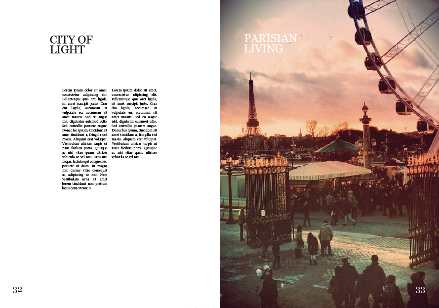
I decided to do my double page spread on my 'what is good' subject, Paris.  I started by adding two columns to allow text to be placed.
This is my final page spread but I decided to change it as I thought it didn't quite suit the subject matter, I decided it would probably look better if one of the photos was more prominent in the double page spread. 
This is my second attempt:
This time I added three columns for text, I think this will benefit my layout more
I think this works better for the double page spread, having an image take up one whole of the double page spread
Applying text to the spread, I decided to then change the amount of columns as I thought this would benefit the layout of the type on the article.  I also added a header, 'the city of light' in the top left hand corner, which I scaled down according to aesthetic preference.
 Change of columns, and adding pages numbers
 Final double page spread:
wiki summary:
The Van de Graaf canon is a historical reconstruction of a method that may have been used in book design to divide a page in pleasing proportions. This canon is also known as the "secret canon" used in many medieval manuscripts and incunabula.
The geometrical solution of the construction of Van de Graaf's canon, which works for any page width:height ratio, enables the book designer to position the text body in a specific area of the page. Using the canon, the proportions are maintained while creating pleasing and functional margins of size 1/9 and 2/9 of the page size. The resulting inside margin is one-half of the outside margin, and of proportions 2:3:4:6 (inner:top:outer:bottom) when the page proportion is 2:3 (more generally 1:R:2:2R for page proportion 1:R). This method was discovered by Van de Graaf, and used by Tschichold and other contemporary designers; they speculate that it may be older.

Tuesday 19 February 2013

PHOTOGRAPHY SESSION ONE//OUGD505

PHOTOGRAPHY SESSION
Today we had a photography session to help us get a better understanding of photographing work in a way that looks more professional for our blogs/websites.  We learnt more about ISO, aperture and shutter speed.