These are the boards for my final design of the Penguin design awards, explaining my reason behind the design and showing the finished art work.
Tuesday 26 March 2013
RESPONSIVE//PENGUIN DESIGN AWARDS//FINAL BOARDS//OUGD503
PENGUIN BOOK COVER// FINAL BOARDS:
These are the boards for my final design of the Penguin design awards, explaining my reason behind the design and showing the finished art work.
These are the boards for my final design of the Penguin design awards, explaining my reason behind the design and showing the finished art work.
Monday 25 March 2013
COLLABORATIVE BRIEF//TED BAKER//FINAL BOARDS INDIVIDUAL INPUT//OUGD03
TED BAKER//FINAL BOARDS
These are my final boards for the collaborative brief highlighting my personal input:
These are my final boards for the collaborative brief highlighting my personal input:
COLLABORATIVE BRIEF//TED BAKER//BRANDING FINALS//OUGD503
BRANDING TED BAKER:
These are the final branding promotional materials for Ted Baker when in Rome, including letter head, business cards, promotional postcards and invitations.


These are the final branding promotional materials for Ted Baker when in Rome, including letter head, business cards, promotional postcards and invitations.


Thursday 21 March 2013


Wednesday 20 March 2013
COLLABORATIVE BRIEF//TED BAKER//BRANDING FOR THE CAMPAIGN//OUGD503
TED BAKER BRANDING:
So far at this stage we have created a look book and a British culture book that will be given out at the launch of the Ted Baker store. We felt we needed to brand the launch of the new campaign. After creating the logo I decided to design some work to compliment this, I have designed a letter head, some business cards and promotional material such as an invite and postcards for the launch.
LOGO:

This is the invitation I designed for the launch of the Ted Baker Store in Milan, the invite is a simple design but I think it needed to be. This is the best way to display high end fashion and the monochrome feel of the branding compliments the renowned high end, stylish Italian fashion culture the world knows them for. It was designed this way in order to be consistent across all designs, Sophia has mocked up packaging with the same colour scheme and simplicity, using the logo as the main focus. The logo is used subtly in this case, with its lowered opacity taking up the majority of the background. The font used is bodini, an Italian classic font that fits the style of the designs. This invite informs of the time, place and event details.

I also designed a letter head, as I thought this would be something that a company needs, especially as they are just opening and so the branding and the promotion of the campaign needs to become popular and familiar to the target audience. Again the design being simple to allow consistency throughout the range of products.

I designed two business cards which simply have the address of the new store in Milan, this is something to get people to recognise the brand and get the name out there, so people are aware of the new campaign.

These are the postcards designed for the campaign, to raise awareness for the stores launch. I have used the images from the collection that is being launched and the look book I created to keep the design consistent.

WHAT IS GOOD?//PARIS//SIXTEEN PAGE RESEARCH BOOK//OUGD505
16 PAGE BOOKLET:
CRIT FEEDBACK
CRIT FEEDBACK
- Type maybe needs more leading x1
- First hand experience shows through a lot, if it is executed right it could be a very useful tool
- nice layout, great contrast between type and image
- very effective layout with a good contrast between type and image
- could make like a newspaper served with coffee and croissant so its like there reading it at a Paris cafe on the street!
- layout could be more engaging, layout pretty plain as it is
- like the simple, well thought out layout and font choice
- the almost vintage style/feel creates a new aesthetic
- be careful of pixelation on one of the photos
- covered important topics, information thats relevant to idea
Sunday 17 March 2013
COLLABORATIVE BRIEF//TED BAKER//PROMOTION//TWITTER//OUGD503
TED BAKER PROMOTION:
To take the concept further and push the campaigns popularity we thought it would be a good idea to get a twitter account, this way we can update things about the campaign, make daily updates and tweet about all the new things Ted Baker when in Rome has to offer.
I set up a twitter account using the logo created to give it some brand identity. I have wrote some tweets and translated them in Italian for the Italian audience:


Saturday 16 March 2013
RESPONSIVE//PENGUIN DESIGN AWARDS//DESIGN DEVELOPMENT//OUGD503
DESIGN DEVELOPMENT:


 I felt this green suited the cover better, a deeper green seems more of a classic colour for penguin. I liked the idea of the repeated toad but tried to incorporate both sets of design, being the toad and the willows, and also the cream textured paper and the deep green. I thought something about it looked unfinished though. I found it hard to place the text on the right design as it didn't work when put on the green background but positioning it on the cream stock was hard because the toad didn't benefit from being scaled down.

 This was my initial design of the overall cover, back and front. I decided to use the willow image on the blurb as I thought it added a pattern to it rather than just a plain cream back.
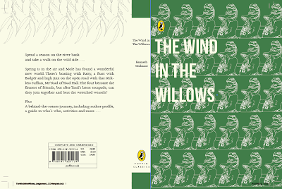 I then decided to change the background colour to the cream, I thought it worked with the green background, however when I changed it to cream and changed the toad line drawings to the green, I thought it worked better. This is my final design for the overall book cover. I changed the text colour and blurb to the same green as the toad line drawings.

My initial design ideas for the cover was to try and make a repeated pattern from the willow branch, this was something I thought could look quite contemporary within design, taking inspiration from Coralie Bickford-Smith.


I tried to incorporate colour into the drawing using different greens. I also tried printing the image off and using water colours and ink to paint onto the image and scan back in, however, it wasn't what I wanted it to look like. I don't think it works well using pain bucket on illustrator either, which is why I tried to use a coloured background that complimented the line drawing.

After drawing the toad I decided to try and repeat the pattern to see how it would look, I added a cream background as I thought it looked too plain against just a white stock.

I then tried transferring the pattern onto a green background, which I thought looked better. I think the repeated pattern works more so than the individual toad as I think its too plain, even with the cream background. I then explored the positioning of type, playing around with the title. I tried having the title cut off down the middle of the page but its obviously an important part of the design and so doesn't make much sense.


Friday 15 March 2013
RESPONSIVE//PENGUIN DESIGN AWARDS//DESIGN SHEETS
WIND IN THE WILLOWS DESIGN SHEETS:
I started off brainstorming some initial thoughts and ideas, possible designs such as patterns, places, characters etc. The most successful ideas, I felt, from looking at previous book covers, are the simplest. Patterns or characters seemed to work the best, but I wanted to incorporate type in a successful way as the brief mentions this.


 These are some sketches of some basic ideas i had for designing, including spine designs. I thought about having the rowing boat as a basic symbol on the spine along with 'The Wind in the Willows' and the authors name. Another idea was to create a clipping mask of the letters of the title of the book from the pattern created.


I started off brainstorming some initial thoughts and ideas, possible designs such as patterns, places, characters etc. The most successful ideas, I felt, from looking at previous book covers, are the simplest. Patterns or characters seemed to work the best, but I wanted to incorporate type in a successful way as the brief mentions this.

Quick ideas:
- Willow pattern
- Toad
- Mole and Ratty in te boat
- River bank

I liked the idea of having the repeated willow branch as a pattern for the front cover, I thought this could be a simple design that worked well, depending on colour and style of drawing.


Thursday 14 March 2013
RESPONSIVE//PENGUIN DESIGN AWARDS//PRIMARY BOOK RESEARCH//OUGD503
BOOK RESEARCH: WATERSTONES
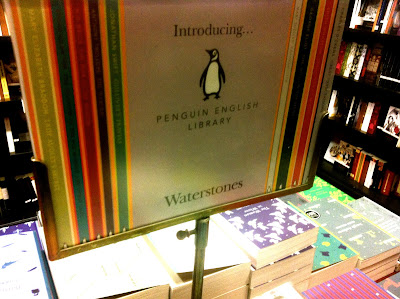


I went into Waterstones today to look at the various book cover designs and get some ideas for the type of thing I would like to design for the Wind in the Willows. I thought the designs for the penguin classics, the contemporary covers worked really well, they looked modern, simple and stylish and communicated the general feel of the book well.

I really like these designs for the Penguin classics, I think the repeated patterns work nicely and look consistent within the set. I think the colour scheme plays a part in the design success of the books. Each book sticks to three or four colours, complimenting each other.

The books consist of simple illustrations, quite detailed but simple in the way they are presented across the page, there are patterns I could consider when designing the Wind in the Willows, for example willow branches in a repeated pattern or a toad.


The blurb is a simple design, text centrally aligned, and a boarder of colour matching the dominant colour on the front cover. When displaying information it benefits being displayed minimally.

Book displayed against others on book shelve, stands out as a more contemporary design.

Wednesday 13 March 2013
RESPONSIVE//PENGUIN DESIGN AWARDS//THE BRIEF//OUGD503
PENGUIN DESIGN AWARDS: PUFFINS CHILDREN'S PRIZE: THE BRIEF
The Wind in the Willows by Kenneth Grahame
Spend a season on the river bank and take a walk on the wild side...
Spring is in the air and Mole has found a wonderful new world. There's boating with Ratty, a feast with Badger and high jinx on the open road with that reckless ruffian, Mr Toad of Toad Hall. The four become the firmest of friends, but after Toad's latest escapade, can they join together and beat the wretched weasels?
First published in 1908, and inhabited by anthropomorphic creatures with quintessential English charm, The Wind in the Willows possesses a wonderful fascination for children of all ages.
Students are invited to design a whole new cover look for The Wind in the Willows, in order to reinvent this classic for a new generation of readers, encouraging children (and adults) to revisit it time and time again, and ensuring that it remains an integral part of childhood.
Your cover design needs to include all the cover copy as supplied and be designed to the specified design template (cut-down B format, 178mm high x 129mm wide, spine 20.6mm wide).
What the judges are looking for:
We are looking for a striking cover design that is well executed, has an imaginative concept and clearly places the book for its market of both children (to pick up and buy for themselves) and adults (to buy for children). While all elements of the jacket need to work together as a cohesive whole, remember that the front cover needs to be able to work on its own and be eye-catching within a crowded bookshop setting. It also needs to be able to work on screen for digital retailers such as Amazon.
The winning design will need to:
- have an imaginative concept and original interpretation of the brief
- be competently executed with strong use of typography
- appeal to the broadest possible audience for the book
- show a good understanding of the marketplace
- have a point of difference from the many other book covers it is competing against
- be able to sit on the shelves of a supermarket or ebook store as easily as it sits on those of more traditional bookshops such as Waterstone's
Sunday 10 March 2013
COLLABORATIVE BRIEF//TED BAKER//FINAL LOOK BOOK//OUGD503
FINAL LOOK BOOK IMAGES
These are the photographs of the final Look Book, I think the layout works well and gives a small introduction to the Italian audience about the new Ted Baker campaign. However, I think if I could do things differently I would of opted for a different binding technique.


These are the photographs of the final Look Book, I think the layout works well and gives a small introduction to the Italian audience about the new Ted Baker campaign. However, I think if I could do things differently I would of opted for a different binding technique.


Friday 8 March 2013
Thursday 7 March 2013
COLLABORATIVE BRIEF//LOOK BOOK DESIGN DEVELOPMENT//OUGD503
LOOK BOOK DEVELOPMENT:


I decided I wanted to have one column for the text, based on research I had done into other look books and fashion publications. This makes it seem a lot cleaner in terms of layout and as the look book isn't going to be too text heavy it made more sense to have less columns. I think its important to have the brand name displayed as it usually is to allow its audience to recognise the brands name and status. The opening page displays the recognisable logo with an introduction to Ted Baker. The opposite page then goes onto talk about the Italian campaign 'When in Rome...' With the heading reading 'Welcome to Italy' in Italian.

Ted Bakers logo is written in a sans serif font which I think will work well when contrasted with our campaign names 'When in Rome...' typeface. I thought it was important to have the 'When in Rome...' campaign name in a serif font as I think this style of typeface is linked more with high end fashion and a stylish, timeless look. The type face we decided on for the campaign title was Bodoni, which was created by Italian typographer Giambattista Bodoni. We thought this was appropriate to use throughout the campaign.


Throughout some of the book I thought it would be good to put Italian translations as it is a campaign being taken to Italy. Not only for language reasons but I think it adds to the style and feel of the publication. A quote that we decided to use throughout the campaign and the look book was "la bella figura" which is an Italian quote about the way people think, act and look in Italy. It is associated with pride and "face". Bella figura is about looking good so that others will respect the effort you have gone to and the style you have. It is about saying the right thing and doing the right thing. It is about acting properly and knowing the etiquette.
We thought this was something that fit perfectly with the campaign and the Italian audience.


This is a section of the look book that talks about Teds globalisation and background Ted.

This is the starting page for the section of the mens collection, after looking at other look books, having the photographs take up the entire page was a feature that a lot of books used within the design.

Photograph of mens collection, right side has a boarder to allow information about the garments and the prices both in pound sterling and the euro.


This is a section that allows you to see the garments with a price, in a different layout.

Subscribe to:
Posts (Atom)