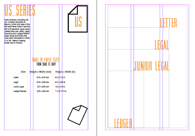
Once I had designed all my diagrams, symbols and title pages on illustrator I started to layout my book on inDesign. I decided to set up my book with each page having three columns each because when the book is printed its A5 format. My opening chapter is stock:
In terms of layout I couldn't decide which way worked best in relation to the columns:
Because I don't have much visual material for the stock chapter of the book and the page consists mostly of writing I wanted to space it out a bit as to not overwhelm the reader with small block writing, this is why I think the second spread works better as the weight measurements are placed on the far right hand side instead of in the middle column to allow some white space to break the text up a bit.
The next chapter is format, starting with the A series, laying out the chart table for the measurements of each series of paper, I think it works better with less lines in the chart as its clearer to read:
So the page doesn't look too empty, with white stock and thin line diagrams I added a paper symbol to the page with the paper series initial in the middle, changing accordingly with all series.
Positioning C series envelopes:
Final page layout for C series:
I decided to put the RA series and the SRA series on the same spread, I think this works better in terms of design otherwise too much empty white space would of shown.


No comments:
Post a Comment