This is the final logo for the Jack Jones Trust, this is the one that the clients chose, I think the typeface is bold enough to be eye catching, and incorporates the red socialist colour highlighting Jack Jone's name. The cogs are symbolic of heavy machinery used in industry, this is relevant because he was the leader of the largest manual union.
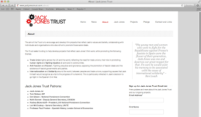
LOGO APPLIED FOR WEBSITE:
This is the logo applied to the website, I think it works at the top of the website, it stands out and is eye catching, you know straight away what the website is. The cogs give a clear representation of heavy machinery.
Logo designed onto complimentary slip:
I designed a complimentary slip for the logo to be placed on, to give it more context.


No comments:
Post a Comment