TYPE SESSION TWO:
The rule of thirds
The rule of thirds governs the placement of points of interest in a scene, for example in a photograph.
The rule of thirds can be divided further into proportions. Breaking down thirds into further thirds.
People looking are more likely to notice the focal point.
Peoples eyes are draw into key pieces of information known as information points for example on a website, the navigation bar is the information point, this is what the eye dreads in proportion.
CANNONS AND GRIDS: VAN DE GRAAF
a gridded page is like scaffolding on a building. It structures the elements . It helps with continuity and organisation.
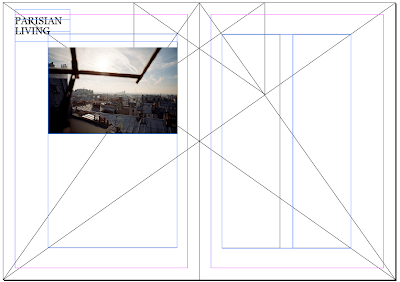
This is a double page spread divided into symmetrical proportions using the Van De Graaf grid system
Margins
Margins can have an influence on the overall feel of a page, too small looks crowded, too full. Too large - exaggeration
double page spread using the cannon:
I decided to do my double page spread on my 'what is good' subject, Paris. I started by adding two columns to allow text to be placed.
This is my final page spread but I decided to change it as I thought it didn't quite suit the subject matter, I decided it would probably look better if one of the photos was more prominent in the double page spread.
This is my second attempt:
This time I added three columns for text, I think this will benefit my layout more
I think this works better for the double page spread, having an image take up one whole of the double page spread
Applying text to the spread, I decided to then change the amount of columns as I thought this would benefit the layout of the type on the article. I also added a header, 'the city of light' in the top left hand corner, which I scaled down according to aesthetic preference.Change of columns, and adding pages numbers
Final double page spread:
wiki summary:
The Van de Graaf canon is a historical reconstruction of a method that may have been used in book design to divide a page in pleasing proportions. This canon is also known as the "secret canon" used in many medieval manuscripts and incunabula.
The geometrical solution of the construction of Van de Graaf's canon, which works for any page width:height ratio, enables the book designer to position the text body in a specific area of the page. Using the canon, the proportions are maintained while creating pleasing and functional margins of size 1/9 and 2/9 of the page size. The resulting inside margin is one-half of the outside margin, and of proportions 2:3:4:6 (inner:top:outer:bottom) when the page proportion is 2:3 (more generally 1:R:2:2R for page proportion 1:R). This method was discovered by Van de Graaf, and used by Tschichold and other contemporary designers; they speculate that it may be older.


No comments:
Post a Comment