FURTHER FORMAT EXAMPLES - RELATING TO MY TOPIC
I have decided to research five more formats but look at them from a more specific and personal point of view as to how I could make them fit in with my ideas for, 'what is good.'
For this brief I want to look at publication design, and creating a range of different publications that could work as a set. I want to look into different ways of how publications can be displayed through different design formats.
PUBLICATION DESIGN
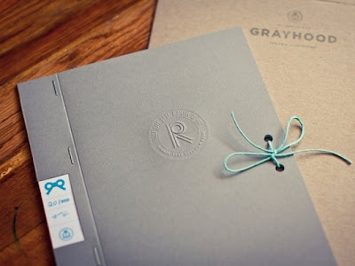
I think this looks good, clean cut, nothing too over complicated with the design. I like the embossing of the logo, this gives it a professional touch. The design of the publication is simple, it looks as though it works as a folder, this is something I could consider when making my 'exhibition of.' Somewhere to enclose information and bring it all together neatly rather than loose designs. The basic design works with it being hole punched on the right hand side, the centre of the margin. Then string is tied to keep it in place.
I think this is quite a simple design in terms of process, its simply string tied around the the publication to keep it in place. I think this could work well if i made a set of three small publications and tied them all together in this way. This could work well within my design as my topic is an exhibition of Paris, and therefore has aspects of travel in it which I think could reflect this style where the string is wrapped around to bound the publications together .
I think the design could work quite well, especially bearing in mins my title is 'An exhibition of Paris.' I think it would look quite nice to have the range of products sealed in a plastic sheet to keep it pristine. i could print onto the cover to give it a professional finish.
This is something that, if I used a suited stock, could make the overall design look well executed. The wooden sleeve has been made to slot the book/s in perfectly. This is something I'd consider if I was going to make two or three small publications, as the idea of a case to keep them all together would appeal to me. The front of the case has also been laser cut with the initials of the book on. This is something that could work well if I found something iconic or recognisable, i.e the Eiffel Tower.
This seems fairly easy in terms of production methods, something simple which can hold the publications together. This is something I'd definitely consider if I was going to make more than one publication for the project.
Laser cut publication sleeve. Production methods would be done on a laser cutter, in terms of durability it looks as though its fairly delicate, depending on what stock you use, however. I think this could look good with some of the architecture around Paris, as it would create some interesting lines, which would be done easily enough but look professional.


No comments:
Post a Comment