5 EXAMPLES OF BRANDING:
PARIS/NEW YORK:2011
For the 2011 edition of La Vittoria, benefitting the Fondation Marie-Vincent, Daniel Boulud from New York and Christophe Michalak from Paris were headliners for a 5-star dinner that paid tribute to the inimitable pleasures of New York and Paris. The thick black typeface and yellow colour was a graphic tribute to the urban style of the Big Apple while the dusty pink combined with the serif typeface brought to mind the romance and allure that could only come from the City of Lights.
I've looked at the Paris side of this branding. Its branding for the French cuisine. The off red, light pink tone is subtle throughout the design. The swirls that surround the word 'Paris' indicate a classiness about the design. The bold type in contrast with the thinner typeface separates the headings. The pink suggests romance, Paris being the city of love/romance.
WANDERLUST HOTEL
I chose this branding as one of my examples because, even though its not specifically about Paris, I liked the design and its rebranding for a hotel in Singapore, in keeping with travelling and places around the world.
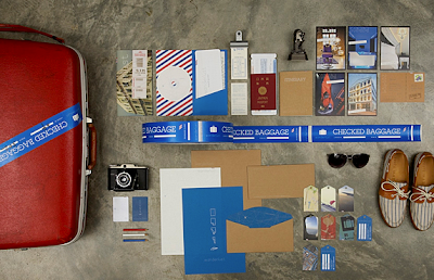
Foreign Policy Design Group designed this amazing brand identity for the Wanderlust Hotel in Singapore–the plane motif is cunningly tucked into the small details of the paper products, so that simple actions such as opening an envelope reveals different minute surprises.
The custom made logotype expresses the feeling of dreaminess, fantasy and the discovery of the surreal landscape of a new world.
The dash lines evoke the impulse to join the lines, as with the impulse to travel. The act of joining the lines is also analogous with the marking of lines from point to point, as with what a traveler would do on his map to plan/track his route. The airmail tricolor band is synonymous with traveling and correspondence – the conveyance of the emotions and thoughts kindled during a journey via mail.
Bus ticket for rate cards; air ticket for brochure inserted into a “air-ticket wallet”; notebook aptly named Itinerary as a multi-purposeful room-directory/guide book/journal for the guests, etc.
The theme is all in keeping with travel and adventure. Its quite playful and eye catching for a brand of a hotel. The reason for this constant reminder of travel and adventure when looking at the rebrand is because the Hotel is called Wanderlust. Wanderlust as the dictionary defines, is a strong innate desire to travel.
The colours and general feel of the branding reminds me of dreaminess, adventure and discovery, mostly because of the colour scheme. The airmail The airmail tricolour band i feel is what reminds you of travelling and getting mail from someone on a journey.
The rebrand of it looks quite expensive as there is an array of stock that all looks to be of high quality. There is also some embossing featured on the Itinerary booklet.
ITS NICE TO BE ALONE IN PARIS
This is a design of a re branded map of Paris, focusing on all the things to do whilst alone in Paris, rather than in couples which is usually expected in Paris.
'In this map we select 32 things to do in the city of light, none of which involve sharing a bottle of wine, eating bread and cheese on the banks of the Seine, or wandering arm in arm with your loved one. In fact, loved ones do not figure at all, this is a guide for the solo traveler and our suggestions are all best enjoyed on your own – although incurable romantics may wish to bring their partners too, we won't kick up a fuss.'
Among the highlights: a taxidermist extraordinaire, mint tea at the Grand Mosque, found photographs at Images & Portraits, along with places to eat, swim, drink, buy vintage erotica and enjoy a solitary ice cream. In short, everything the intrepid visitor might require.
The map is illustrated by Lord Dunsby. It is A3 (297x420mm) folded to A6 (105x148mm), and litho printed on recycled paper. The colour reminds me of travelling, it has the same blue, white and red airmail colour as the Wanderlust rebrand. The illustrations are simple as to not distract from its main purpose, giving directions.
A DROP IN THE OCEAN
A brief to highlight remote islands around the world delivered through a promotional package and catalogue.
'A Drop In The Ocean' profiles five different locations in its first edition and aims to inform and inspire the reader about these unique environments. Facts, figures, photographs and a brief history of each island/island group can be seen in the hand-bound catalogue. Corporate stationery to address the customer has also been designed along with individual itinerary booklets and a set of limited edition prints featuring maps of the islands, which are all wrapped into a deluxe package.
When looking inside the items you can see photography plays a significant part in these designs. The design is quite simple and the colour comes from the stock rather than the ink. The stock looks quite expensive and the collection works well as a whole.
LIVE THE LANGUAGE: PARIS
These are photographs with a logo placed over the top, exploring Paris through type, I found it hard to come across branding and identity that related to Paris, so have used this because I think it works. These shots show a typical Paris scene with a suited type face placed over the top. Each one works differently, yet they all have a Parisian atmosphere and culture about them.
They have used things known to be typically French, such as the macron shot and the photo of the Eiffel Tower. All the type faces suit the individual photo, the one used over the Cafe picture doesn't necessarily scream Paris, but its quaint italic and deco-inspired lines seem appropriate.


No comments:
Post a Comment