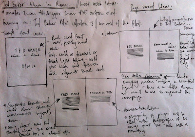
I started drawing out some layout ideas for the publication after looking at some other look books and some publication research online, as well as looking at layout and style of Italian Vogue.
I started drawing some initial layout ideas, from looking at the inspiration I had gathered I wanted to have one column as I think this would give it a minimalist look and a clean finish on white stock with a fashionable, vogue style font.
Further layout ideas, looking at layout between image and type and how I could layout the A/W collection whilst managing to keep a 'high end' style throughout. Close up images of the clothing collection. White boarders around certain images as to allow space for type about the garnets. Introduction to the look book is a section about the Ted Baker story, the history and the campaign, When in Rome.


No comments:
Post a Comment