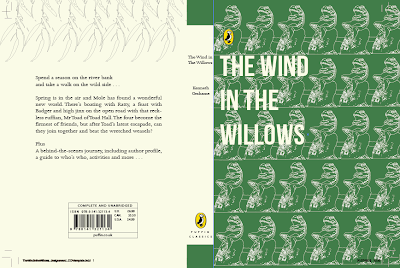
My initial design ideas for the cover was to try and make a repeated pattern from the willow branch, this was something I thought could look quite contemporary within design, taking inspiration from Coralie Bickford-Smith.
I tried to incorporate colour into the drawing using different greens. I also tried printing the image off and using water colours and ink to paint onto the image and scan back in, however, it wasn't what I wanted it to look like. I don't think it works well using pain bucket on illustrator either, which is why I tried to use a coloured background that complimented the line drawing.
After drawing the toad I decided to try and repeat the pattern to see how it would look, I added a cream background as I thought it looked too plain against just a white stock.
I then tried transferring the pattern onto a green background, which I thought looked better. I think the repeated pattern works more so than the individual toad as I think its too plain, even with the cream background. I then explored the positioning of type, playing around with the title. I tried having the title cut off down the middle of the page but its obviously an important part of the design and so doesn't make much sense.
I felt this green suited the cover better, a deeper green seems more of a classic colour for penguin. I liked the idea of the repeated toad but tried to incorporate both sets of design, being the toad and the willows, and also the cream textured paper and the deep green. I thought something about it looked unfinished though. I found it hard to place the text on the right design as it didn't work when put on the green background but positioning it on the cream stock was hard because the toad didn't benefit from being scaled down.This was my initial design of the overall cover, back and front. I decided to use the willow image on the blurb as I thought it added a pattern to it rather than just a plain cream back.
I then decided to change the background colour to the cream, I thought it worked with the green background, however when I changed it to cream and changed the toad line drawings to the green, I thought it worked better. This is my final design for the overall book cover. I changed the text colour and blurb to the same green as the toad line drawings.


No comments:
Post a Comment