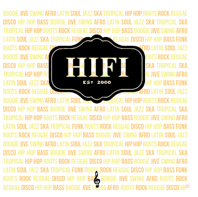
After taking my crit feedback into account about my packaging design, I have amended certain aspects of it that people picked up on, the main ones being:
- Too subtle - range is too subtle due to lightness/colour of type
- Possibly include some music related imagery
- Make the HIFI logo stand out more so
- Take away black outlines
These are the new designs, taken all those into considerations, the lines for the packaging have been lowered in opacity:


No comments:
Post a Comment