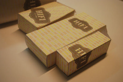
These were the mock ups I produced for the concept crit, I used the HIFI logo and placed it in different positions. My idea for the design came from one of the promotional flyers that HIFI have, it listed all the genres of music played at the venue, I used these genres in my packaging design:
CRIT FEEDBACK:
STRENGTHS:
- good design - like the different genres of music being part of the design
- works well as a series
- very professional looking - well constructed
- consistency throughout the products works really well
- colours are subtle and this works well, however, because of this the readability is poor
- good range of packages, different styles and sizes
- love the text background
- packaging fits together perfectly
- lids open and close fine
- good representation of HIFI club
- subtle colouring looks professional
- good variations of logo on range, makes them more individual
AREAS FOR IMPROVEMENT:
- colours are a bit faint would be nice if they were bolder, bit too subtle x2
- print on nicer stock for final design x2
- would get rid of black outline on the edges x2
- HIFI logo fully black? x2
- printing is inconsistent, one is fainter than the rest
- needs more impact, text hard to read due to colour and scale
- probably would of used different colours for the background text, can't see the yellow that well
- would make the HIFI logo less transparent so it stands out, maybe alter the colour of the logo
- some imagery representing music would fit well
- text hard to read due to colour on chosen stock
- text ends on one design very abruptly
CONSIDERATIONS:
- Overall really like the packaging, works very well, fits in with the original logo
- some imagery would make the products look more fun, less formal, music representations such as speakers, musical notes etc.
- construction of products looks really well done, however better quality of stock would improve the appearance of the product
- maybe make the packaging a bit more musically inspired. The genres work well but at first glance you might not know what type of company it was
- colour choices have good harmony but need more impact, makes range feel too subtle
These were the things we decided as a group make good quality packaging:
- STOCK QUALITY
- CRAFTSMANSHIP
- RANGE OF NETS
- COLOUR SCHEME
- CONTEXT


No comments:
Post a Comment