DESIGNING FOR WEB//WEB DESIGN WORKSHOP TASK//OUGD504
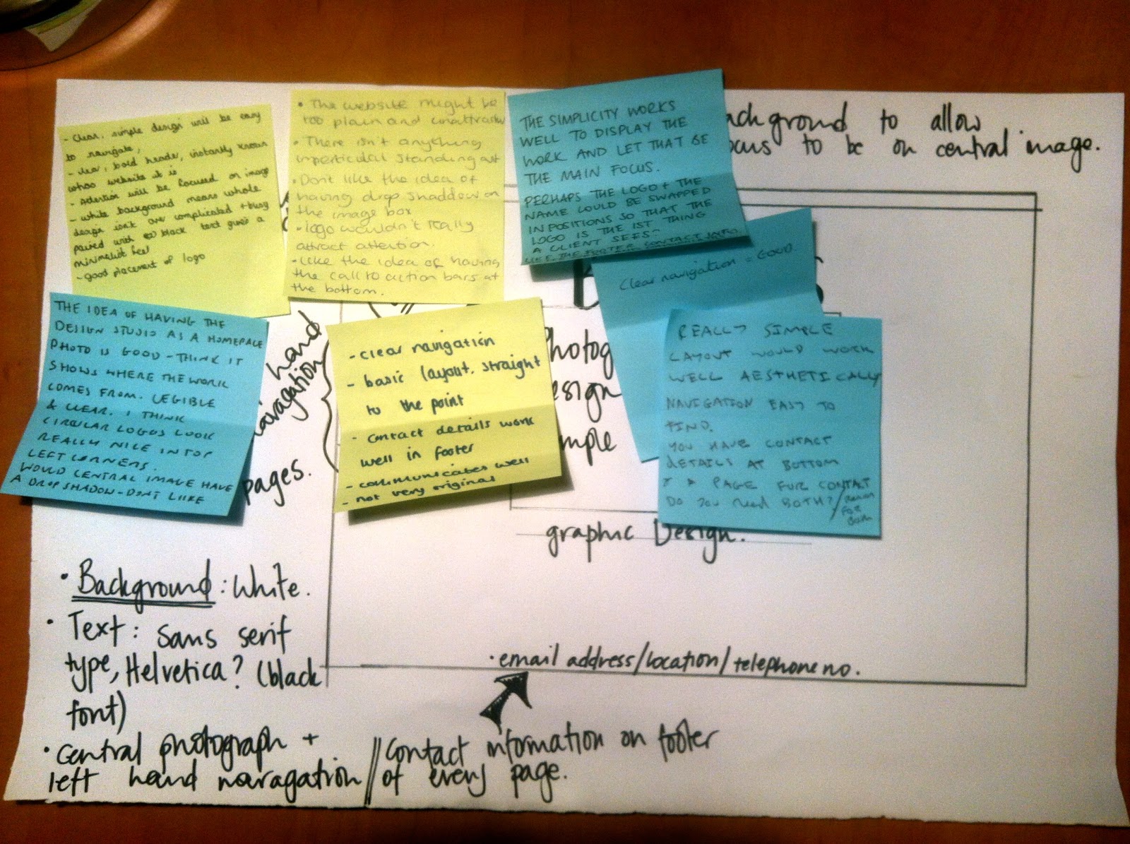
In the studio workshop we had to do a quick sketch of a basic idea of how we wanted our homepage of our website to look:
We then had a crit, this was my feedback:
- clean, simple design, will be easy to navigate
- clear, bold header, instantly know whose the website is
- attention will be focused on image
- white background means role design isn't over complicated and busy, paired with black text gives it a minimalist feel
- good placement of logo
- really simple layout would work well aesthetically
- navigation easy to find
- you have contact details at the bottom of the page do you need a separate page for contact details, do you need both?
- clear navigation = good
- clear navigation
- basic layout, straight to the point
- contact details work well in footer
- communicates well
- not very original
- the simplicity works well to display the work and let that be the main focus
- perhaps the logo and the name could be swapped in position so that the logo is the first thing a client sees?
- like the footer contact details, as its neat and communicates well
- the idea of having the design studio as a homepage photo is good - think it shows where the work comes from
- legible and clear
- I think circular logos look really nice in top left hand corners
- the website might be too plain
- logo wouldn't really attract attention


No comments:
Post a Comment