DESIGNING FOR WEB
In todays session we were asked to look at a number of websites and note down our initial reaction within the first five seconds:
Web designers make the mistake of making the design of the website the most important thing, the content of the website is the most important thing, the design should be functional and the content should look visually appealing.
ollymoss.com - black, dull, empty, space, boring, simple

malikafavre.com - busy, playful, hectic, bright, movement, colourful

360langstrasse.sf.tv/page/ - google street map, scroll, photography, german, text

mercertavern.com - hipster, retro, smart,clean, black and white, boxes/lines

noble-design.co.uk - feminine, colourful, vector, smart

caavadesign.com - photoshop, c.d, waves, colourful, modern design, simple

sb-studio.co.uk - clean, Swedish, dull, clinical, photograph

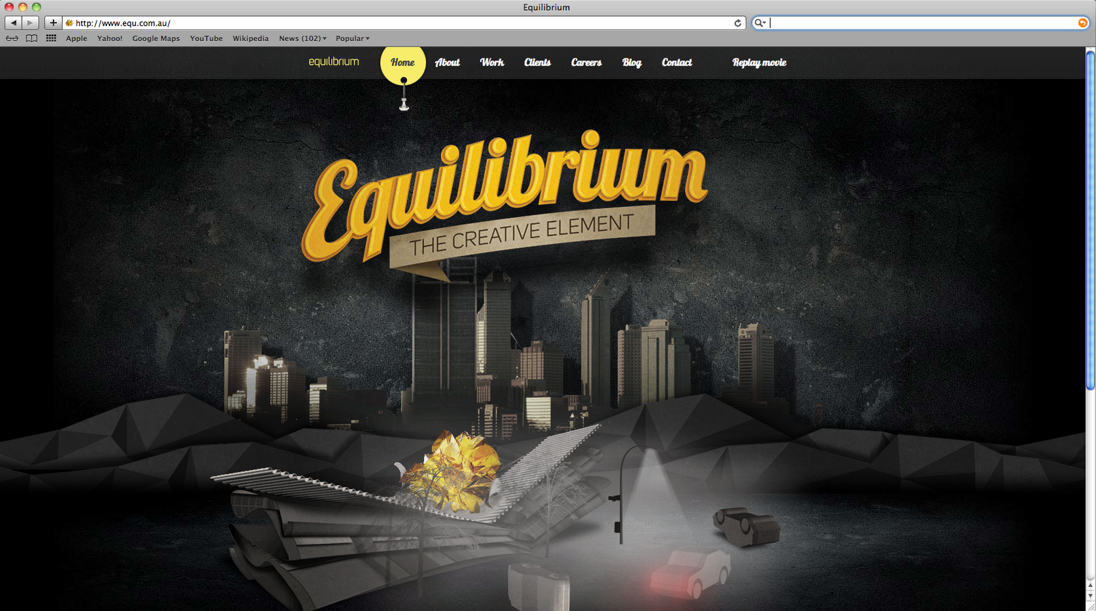
equ.com.au - vector, slow, triangles, 'drive-in movie'
smart-heart.ru - interactive, split, horizontal, minimalist

formfiftyfive.com - dark, orange, type, blog, machine

3 KEY QUESTIONS:
-What is the purpose of the website?
-Who is the target audience?
-What do the target audience need?
HOW TO GET THE ANSWERS?
-Create surveys for the target audience/research
-Look at similar websites with the same target audience
-Ask studios what they want to see
-Research studios
-Email them, be creative, try and do something different
THREE MAIN THINGS TO CONSIDER WITHIN WEB DESIGN:
-TEXT
-IMAGE
-NAVIGATION
WEB LIMITATIONS:
TEXT - You can only use standard fonts, you must specify a font family, if you don't specify a font it will always come up as 'Times New Roman' Webkit allows you to download a font but you still have to pay a license fee as people can download this font.
COLOUR - RGB colour mode for screen based images, more restricted than RGB is working on the internet, websafe colours is an internet version of RGB, a hexadecimal code helps you to specify the colour.
SCREEN SIZE - width and height - standard sizes you have to go by, massive variety of computer screens, you have to decide what size your going to work with, has to be consistent on all screens. Something to consider when designing.
RESOLUTION (PPI) - the resolution for screen based image is 72 PPI (pixels per image)
WEB DESIGN TERMINOLOGY:
HTML - Hypertext markup language
URL - Uniform resource locater
CSS - Cascading style sheet
FTP - File transfer protocol
CMS - Content management system/solution
This is the basic outline for the website that we will make, this is a quick mock up of the specific details:


This is the basic outline for the website that we will make, this is a quick mock up of the specific details:


No comments:
Post a Comment