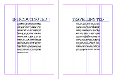
I decided I wanted to have one column for the text, based on research I had done into other look books and fashion publications. This makes it seem a lot cleaner in terms of layout and as the look book isn't going to be too text heavy it made more sense to have less columns. I think its important to have the brand name displayed as it usually is to allow its audience to recognise the brands name and status. The opening page displays the recognisable logo with an introduction to Ted Baker. The opposite page then goes onto talk about the Italian campaign 'When in Rome...' With the heading reading 'Welcome to Italy' in Italian.
Ted Bakers logo is written in a sans serif font which I think will work well when contrasted with our campaign names 'When in Rome...' typeface. I thought it was important to have the 'When in Rome...' campaign name in a serif font as I think this style of typeface is linked more with high end fashion and a stylish, timeless look. The type face we decided on for the campaign title was Bodoni, which was created by Italian typographer Giambattista Bodoni. We thought this was appropriate to use throughout the campaign.
Throughout some of the book I thought it would be good to put Italian translations as it is a campaign being taken to Italy. Not only for language reasons but I think it adds to the style and feel of the publication. A quote that we decided to use throughout the campaign and the look book was "la bella figura" which is an Italian quote about the way people think, act and look in Italy. It is associated with pride and "face". Bella figura is about looking good so that others will respect the effort you have gone to and the style you have. It is about saying the right thing and doing the right thing. It is about acting properly and knowing the etiquette.
We thought this was something that fit perfectly with the campaign and the Italian audience.
This is a section of the look book that talks about Teds globalisation and background Ted.
This is the starting page for the section of the mens collection, after looking at other look books, having the photographs take up the entire page was a feature that a lot of books used within the design.
Photograph of mens collection, right side has a boarder to allow information about the garments and the prices both in pound sterling and the euro.
This is a section that allows you to see the garments with a price, in a different layout.


No comments:
Post a Comment