Tuesday, 21 May 2013

WHAT IS GOOD?//PARIS//END OF MODULE EVALUATION//OUGD505

END OF MODULE EVALUATION OUGD505

What skills have you developed through this module and how effectively do you think you have applied them? 
I feel with this module it has given me the opportunity to develop my research skills, I spent a lot of time researching into my subject before creating my final products, and felt like the initial body of research and original concepts developed extensively from that point.  It has highlighted the importance of research to inform design development.  I feel throughout this module I have learnt the value of developing a successful concept through workshops and tasks.  This has made me think in more detail about my ideas, how well they work and if they could be improved.  I tired foiling for the first time in this module which I think worked well with my set of products and is something I would like to use more in the future.  I felt this module really allowed me to engage in the subject as I chose it and was allowed to take it further in a direction that I preferred. 

What approaches to/methods of design production have you developed and how have they informed your design development process? 
I have used different research methods to inform my design direction.  I felt the research booklet was a new approach, for me, my project progressed a lot since first creating the research booklet so it was good to look back and see how my research and ideas had developed from the half way point.
I screen printed in this module to design my products for the restaurant area of the hotel, I definitely want to improve my screen printing skills as I feel this is a good way of making a range of products on different materials and products.  I enjoyed using a stock that I cant print on in the digital print room which worked well on screen print, range of stock and printing methods is something I want to explore further next time.

What strengths can you identify in your work and how have/will you capitalise on these? 
I feel throughout this module research was a strength that has definitely improved.  It was something that I did regularly to enable me to make an informed design decision.  I felt this on going research and concept workshops really helped me to develop my idea further and I think the ideas, concepts and research progressed throughout this module, developing into work that I found interesting and engaging.  This was one of the first branding briefs I had done and I found myself enjoying the process of designing products for a range.  I felt my research helped inform decisions such as the logo and hotel name as well as smaller details like the name of the cocktails on the menu (named after french poets and writers.)  I feel the digital aspect of my range worked quite well, I have started enjoying mocking up websites more and I think the app design was a good way of enabling more of my initial research to show through.  I feel my presentation boards have improved in terms of layout and work as a set that takes you through my thoughts, design development and final outcomes.

What weaknesses can you identify in your work and how will you address these in the future?
I feel I can identify a lot of weaknesses within my work from this module, the most crucial being time management, which had a knock on effect with other areas of this module that I would of liked to improve/done differently.  Because of having a number of module deadlines and final crits to attend I felt it difficult to try and juggle all the modules at once and struggled to organise my time effectively.  I found myself needing more time to really produce everything I wanted to in this brief and if I would of maintained a work and research ethic on a regular basis with this module I wouldn't of felt like I had so much to do towards the end, which I regret because it definitely had an impact on the final results and quality of the work.  Because I had so much freedom with this brief, in terms of being able to choose a topic and direction, I feel disappointed at the outcome because even though I liked the direction it was going in I wanted more time to expand, explore and leave room for trial and error.  Another weakness, mainly down to time management and organisation skills was not leaving myself enough time to try processes.  I managed to do foiling and screen printing but felt disappointed with the results of screen printing and if I would of given myself more time I would of been able to go back and do it again.  In general I needed more time as the quality of photographs for my final range of products were poor and this is something that makes a difference with presentation.

Identify five things that you will do differently next time and what do you expect to gain from doing these? 
  • Time management - This is something I feel I need to address at the end of every module.  I think my work could be massively improved if I give myself enough time for the design and production of my work.  I feel I always take too long coming up with concepts and researching, trying to ensure that my idea will work, however sometimes I think you just need to start designing and see where it goes from there.  I always underestimate the time certain projects will take and so this effects the final outcome and quality of my work.
  • Photographing products - This is something that will improve the final presentation of my work and it is crucial that I give myself enough time to not rush this.
  • Primary research - I feel informed and varied primary and secondary research is something that could inform and improve my practice and is something I will explore further, especially within this module.
  • Range of products/outcome - I feel next time I want to explore the possibilities of the final outcome and look at a range of products that could be made.  Another area I want to improve is exploring different processes and print methods which could improve the final outcome instead of limiting myself to stocks and digital print.
  • Concept/idea generation - This is something that I need to get quicker at in order to give myself enough time to make the product/publication to a high standard.  I feel like in the early stages of idea development I should test out different ideas and do quick mock ups and designs to see whether they would work and how I could develop them further, instead of waiting until I think an idea is strong enough to take forward.
  • Crits - Being prepared for crits to get the best feedback possible to take forward in my designs.
Attendance = 4
Punctuality = 4
Motivation = 4
Commitment = 3
Quantity of work produced = 2
Quality of work produced = 3
Contribution to the group = 3

Sunday, 12 May 2013

WHAT IS GOOD?//PARIS//PRINTED PRODUCTS//OUGD505

FINAL PRINTS 
These are the final printed products, Im not happy with the screen prints as I feel they didn't turn out the way I wanted them to and the quality of the final photographs need improving:

Saturday, 11 May 2013

WHAT IS GOOD?//PARIS//FINAL BRANDING/DIGITAL//OUGD505

BRANDING:
These are the final designs for the branding of:
  • letter head
  • business cards
  • postcards
  • drinks menu
  • menu
  • stickers


Friday, 10 May 2013

WHAT IS GOOD?//PARIS//FINAL APP DESIGN//OUGD505

FINAL APP DESIGN:
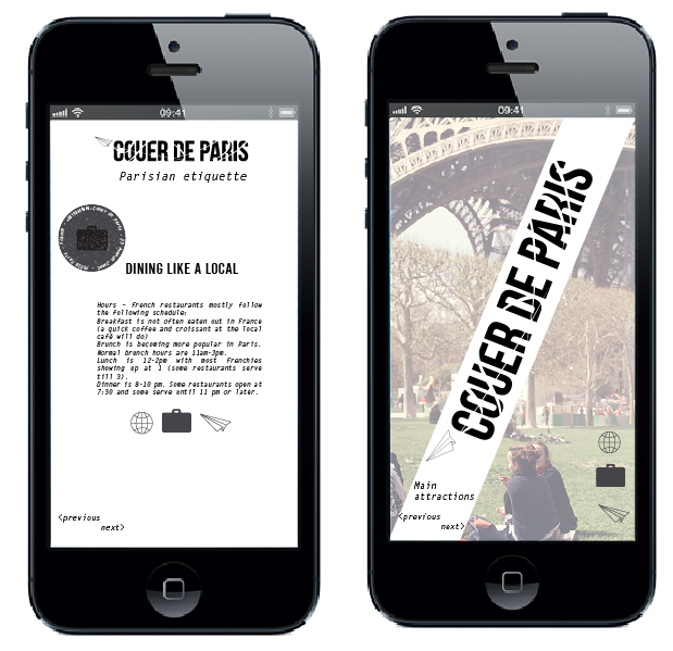
These are the final designs for the app.  The idea of the app is customers from the hotel can download it as a guide of things to do in Paris whilst staying in the city.  It focuses on main attractions, the unconventional tourist activities, places to eat in Paris, cafe culture, a french phrase page and French etiquette (with an element of humour.)

APP LANDING PAGE AND CONTENT PAGE:


WINE AND DINE PAGE AND CAFE CULTURE PAGE:
This is the page where a selection of french restaurants and cafes are available to scroll through.
PARISIAN ETIQUETTE AND LANDING PAGE FOR MAIN ATTRACTIONS:

WHAT IS GOOD?//PARIS//TRAVEL APP DESIGN//OUGD505

HOTEL TRAVEL GUIDE APP:
I decided something that could work quite well for the hotel that coincides with the whole theme of travelling would be to make a travel app.  Something that customers would be able to download for free that enabled them to get the best guide for things to do in Paris, this would be a good way to incorporate all the previous research on Paris.

Categories that could be included in the app:
  • Cafe culture - this is something prevalent in modern Parisian culture and with a variety of different cafes to choose from this would be helpful in narrowing down atmosphere, decor, food and drink etc.
  • Main attractions - although this is meant to be based on the idea of an unconventional tourist and a taste of true parisian culture, I feel I still need to include some of the main attractions as some of them are considered as 'to dos' whilst visiting the city.
  • Lazy sundays - this is the part of the app that offers an alternative, a look into the true parisian culture, flea markets, food halls, picnic spots etc.
  • Wine and dine - a selection of restaurants and bars
  • Parisian Ã©tiquette 
  • The French phrase guide
APP HOMEPAGE:
Using symbols to keep branding consistent. The names for the app were either out of Couer de Paris: travel guide, Couer de Paris itinerary or couer de Paris: Live like a Parisian.  I thought the last one would work best as I want to include more than just travel based information.
Final app name:
For the digital design to be consistent and coincide with the website I decided to use images half cropped, similar to the website, for the app, this is a photo i found of a passport, with a Paris stamp on it which I thought would work for the homepage of the app, I used the hotels symbols and logos with the colour scheme for the design:
Each page you click on will offer a variety of things to do and see in Paris, this is the page for cafe culture.  When you click on it it will take you to a selection of cafes, each one having a faded photo of the outside of the cafe with a description and address, directions etc.  You can scroll across using this button to take you to the next cafe:
I added the logo to the page in order to keep the branding consistent:
page example of one of the cafes in the cafe culture part of the app.
WINE AND DINE PAGE
This works the same way as the cafe culture page, tapping left and right to go between a selection of hotels, to find whats best for the specific person.

I started designing the app by finding images of Paris and places that I thought could fit the interior of my hotel, I then used these as imagery for the app:
The image has then been made into a clipping mask that is part of the design for the background of the app:
Parisian étiquette page:
Main attractions opening page:
I think this app could be used as a good guide when staying in the hotel, this was a good way of using my research from the first half of the brief as it focuses on things to do in Paris and the unconventional tourist guide.

Wednesday, 8 May 2013

WHAT IS GOOD?//PARIS//WEBSITE CONTENT//OUGD505

ABOUT THE HOTEL:
Coeur de Paris: We are a hotel based in the heart of Paris.  We offer the finest Parisian experience around, with our guests getting a true feel for French culture, the unconventional tourist experience.  We bring the tradition and classical Parisian culture with the contemporary and refined style of modern city Paris.

ROOMS:
At Couer De Paris we offer a range of rooms to choose from.  All our stylish and unique suites offer luxury and comfort with a view over looking the city of light.  Each room has its own individual theme based on French culture/art/history.  Each coming with its private bathroom, balcony view, double bed and cosy sitting area.

Central navigation bar, including homepage, reservations, dining, gallery and rooms.
An image of one of the rooms will be visible on the left hand side, on the right of the page will be information about the rooms and a gallery, an english and french translation:
Room options:

METRO
Line 1
Line 2
Line 3
Line 4
Line 5
Line 6
Line 7


DINING:
Here at Coeur de Paris we offer the finest french cuisine and a range of wines and cocktails, something for everyone.  Choose from our breakfast menu, continental breakfast, sweet and savoury crepes, croissants and fresh juice served with a selection of teas and coffees.

Our dining menu offers the finest french dishes around with a special set menu every day and chefs recommendations. 


For the food I wanted to show a selection of images that would set the style for the dining area, when hovering over an image before clicking on it this will be highlighted whereas the rest of them would have lowered opacity.  There will be an option to download the menu on this page.
HOMEPAGE DEVELOPMENT:
For the homepage I wanted to use images of Paris as this is what the whole concepts been based around and could create some nice visuals and set the style for the website.  I cropped part of the image out so that I could place the logo on the homepage so it stands out:
Logo and navigation bar placement:
GALLERY PAGE:
For this page I wanted an image to take up most of the screen, similar to the homepage, as it is the gallery page.  The idea is that when you click on a photo from the middle of the page it appears and the two halves of the image come together to create the full image.

original image:
Cropped and opacity lowered image to allow thumbnails for the gallery to show:

Tuesday, 7 May 2013

WHAT IS GOOD?//PARIS//SCAMPS FOR WEBSITE DESIGN//OUGD505

SCAMPS:
These are the scamps i have drawn out to get some ideas of how to lay out my website before mocking it up.
I wanted the main designs of the website to be based around photography because I found images from a hotel that I thought would suit the style I was wanting to imitate for my own hotel.
As I want the focus to be based around photography (images of the hotel and of Paris) one side of the website will be made out of a part of an image, the opacity being lowered as though it is part of the background design.
On the homepage I want the hotels name and logo to be placed largely and diagonally across the cut image, I think this is eye catching for the homepage and works as a different logo placement compared to all the other pages of the website.
As part of consistent branding I would like the dashed trail of the paper airplane to be spread across each of the pages, something subtle, lowered opacity but noticeable enough, the plane could fly down when clicking on the link to open that page.