BOLD TYPEFACES:
Sans serif type face, this supports the modern, contemporary logo they wanted. Simple symbolism. The colour red, always been a socialist colour, Labour party colour etc. Bold type to catch attention. Potentially one of these type faces could work for the logo, as it needs to stand out and be bold, especially with what Jack Jones and the trust does, it needs to make a statement. I think the top typeface is too bold for the logo to be used on various different products of distribution, it could work on letter heads but I think something simpler would be more effective for business cards etc. Possible options to be used when placing images are the middle two as I think they stand out but wont completely take away from the symbolism that I intend to design.

I think these typefaces, especially the top one, are too elegant for the trust. I think the third one could be a potential, out of the four.

SYMBOLISM:
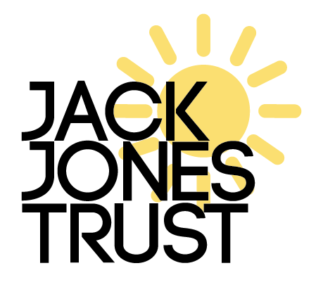
This is the first attempt using the sun symbolism, I think the sun possibly makes it look too child like, 'fund raiser' type logo, I don't think the typeface and the sun symbolism combined works well together as it creates a 'primary school' type feel.

Trying with a different typeface, I think this one, code bold, works a lot better for the trusts image, it makes it look less child like and friendly, however, I don't feel like its portraying the type of group Jack Jones is, it does't seem clear now that I have made the logo digital, wat the sun represents.
This is the combination of the sun symbolism and the turning cogs, which I don't think works that well together. I don't think the colour contrast works well for what the trust represents.

I think the typeface works better, on the second logo design, its bold and simple and contemporary and works better with the cog symbolism.

I think it works better without the sun symbolisation as the cogs speak a clearer message about the Jack Jones trust and the combination of the sun and the cogs doesn't fit that well together. I tried changing the cog yellow to represent the sun and the cog, however I don't think it looks quite right and works better in black.


After talking to the client they decided they wanted the colour red incorporated:

Other designs, looking at composition of logo and incorporating colours, especially to see how red can be incorporated into the design:

No comments:
Post a Comment