RESPONSIVE//UK GREETINGS//PRIMARY CARD RESEARCH//OUGD503
CARD RESEARCH//PAPERCHASE
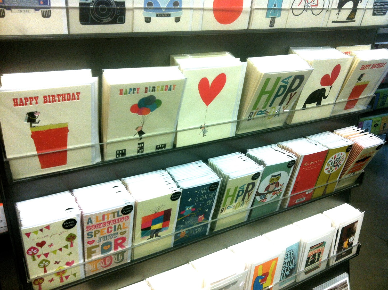
I went into Paperchase today to see the style and range of cards that are currently on the shelves, I noticed a lot of simple, illustrative designs which I thought worked well, quite a few cards used a good quality textured stock which helped the card look more high end.
I like these simple card designs, I think cards work well with white space, nothing too distracting, a simple image or drawing placed centrally always works. I think smaller cards work best on a textured, cream stock.
I think stock plays an important part when designing cards, I really like this type of brown card used for the envelopes of the cards and the black pen lined drawings on the brown stock, I think the contrast works well. This is something I could consider for my design. Whilst looking around paperchase I'd noticed a certain style of card seemed to be most popular, focusing on illustration, humorous cards seem to be popular as well as the most obvious 'happy birthday.'
Cream stock, minimalist design style, I think colour is quite important when sticking to a simple card design. I think the more simple the design the more successful the design on the card is. You also have to think about the relationship between type and image and whether the front of the card would benefit from having type.
Some cards focus solely on type, this depends on whether the quote or passage you have to say is strong enough to stand on its own. Cards with just text on the front have become more popular, especially in specialist card shops and companies such as Paperchase and Scribbler. The typeface or type design doesn't have to be anything particularly eye catching or bold, its more about the sentiment of the actual words.
Something I want to think about when designing my own range is the processes and finishes used to give the card a special edge. I think laser cutting something could look really nice depending on how subtle it was. Things like foiling and embossing always make cards look of higher quality when printed on high end stock.
I liked this extra touch, with the main image being a cut out and being placed on the actual card and held there by the four corners, this is simple but is different to the standard format card and is something I could think about when considering card size and format and what special/different techniques could be used.


No comments:
Post a Comment